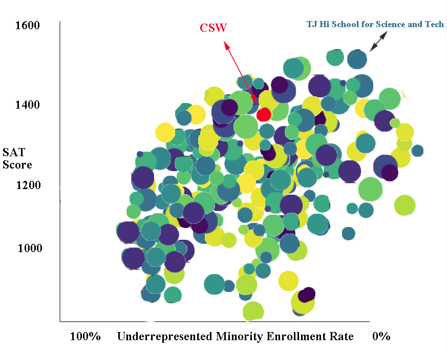
X=Black + Hispanic Enrollment Rate
Y=SAT average score
Each Bubble represents a high school, size=Total Enrollment, color=type of school
The labeled school at the top right is the TJ High School for Science and Technology in Virginia, regarded by many to be the #1 high school in the United States. It tops at SAT scores, but has very low under represented minority enrollment.
The red bubble represents CSW(Charter School of Wilmington), it has somewhat good SAT scores and 12% URM.
What patterns can you find from this chart? What is your vision? What is your action to make the school better?
